4 Color Rules You May Use For Home Decor

color rules you may use for home decor

Color is often the most difficult part of home decor to decide on. There are so many shades to choose from and they need to be put together in the right proportions, otherwise they won’t work like you want that. If you are hesitating, check these color rules that we’ve listed below – they will help you create a balanced and stylish look.

The 60-30-10 Rule

The 60-30-10 rule is a classic one, which always works, no matter your personal aesthetic is and what style you’ve chosen. In such a setup you’ll use three colors and 60, 30 and 10 are the percentages of these shades. First, choose a shade that will be dominating and decorate approximately 60% of the room with it. Next will be your secondary color, which is typically a bit bolder and takes up about 30 percent of the space. Finally, your accent color is your boldest shade and should make up the remaining 10 percent.
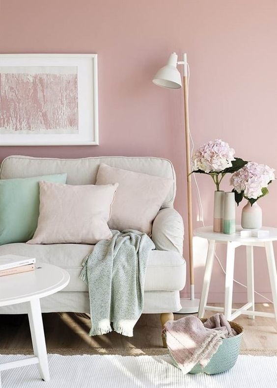
blush as the main color, cream as a secondary one and mint as an accent shade to rock

blush as the main color, cream as a secondary one and mint as an accent shade to rock

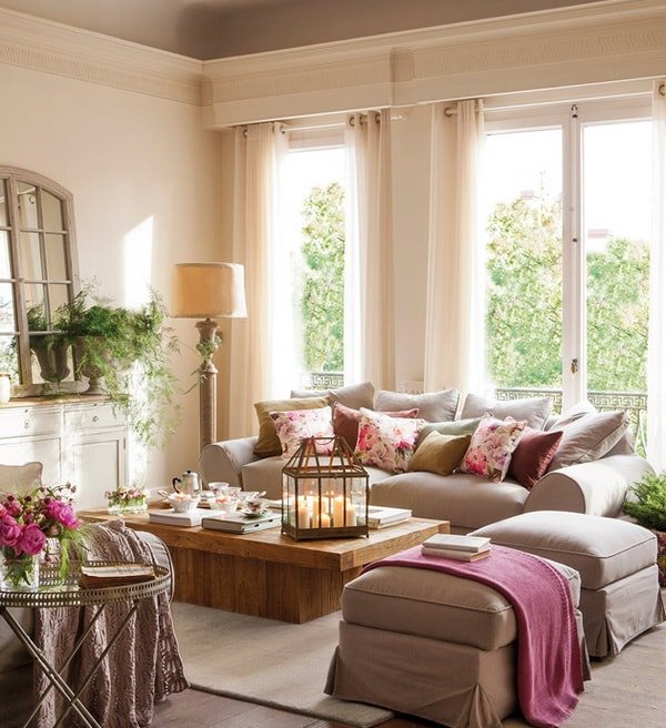
a cozy and welcoming living room with ivory as the main color, tan as the secondary one and pink for accents
a cozy and welcoming living room with ivory as the main color, tan as the secondary one and pink for accents

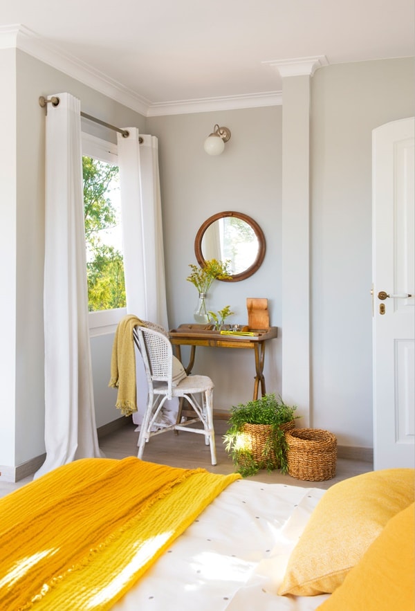
a super bright bedroom withdove grey as the main shade, creamy as the secondary tone and bright yellow for accents
a super bright bedroom withdove grey as the main shade, creamy as the secondary tone and bright yellow for accents

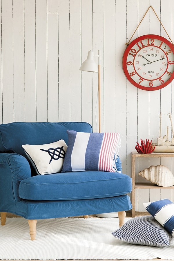
a nautical nook with cremay as the main color, blue as the secondary and red for highlighting the space
a nautical nook with cremay as the main color, blue as the secondary and red for highlighting the space

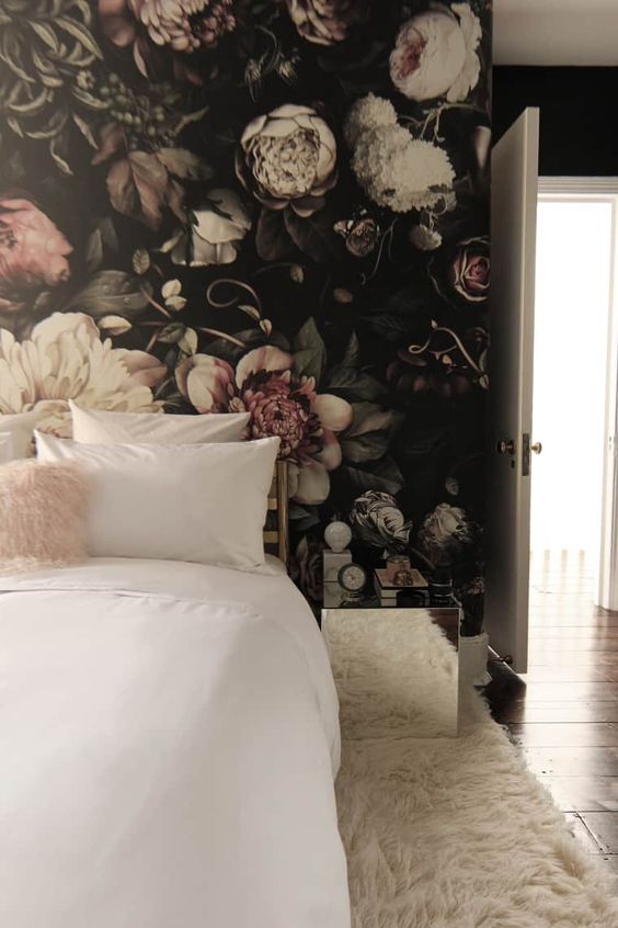
a trendy moody bedroom with ivory as the main color, blush as the secondary one and dark tones for more drama

a trendy moody bedroom with ivory as the main color, blush as the secondary one and dark tones for more drama

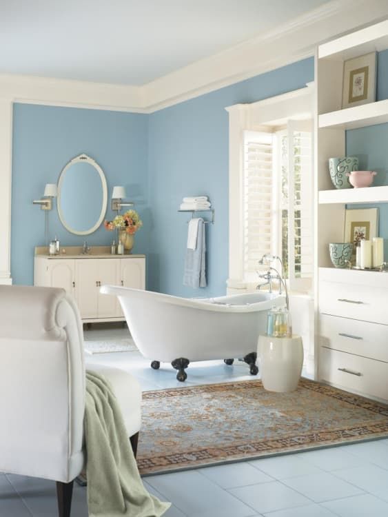
ivory as the main shade, blue as the secondary and some tan touches to make up a welcoming bathroom

ivory as the main shade, blue as the secondary and some tan touches to make up a welcoming bathroom

Warm vs. Cool Colors

The choice of warm or cool colors will affect the energy of the space. Since warm colors tend to bring an upbeat and welcoming feel to a room, they’re best in entertaining spaces. Think about using these shades in your dining room or kitchen. Cool colors, on the other hand, are more subdued. They work best in bedrooms and office spaces, where a calming energy is appreciated. You may also take a look the psychological effects that each color brings to make your choice easier.
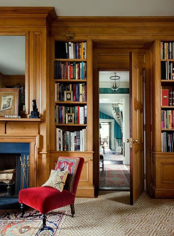
light-stained wood is a great idea to bring warm neutrals to the space, and wood never goes out of style
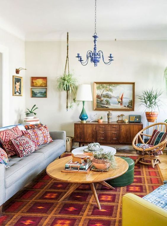
light-stained wood is a great idea to bring warm neutrals to the space, and wood never goes out of style

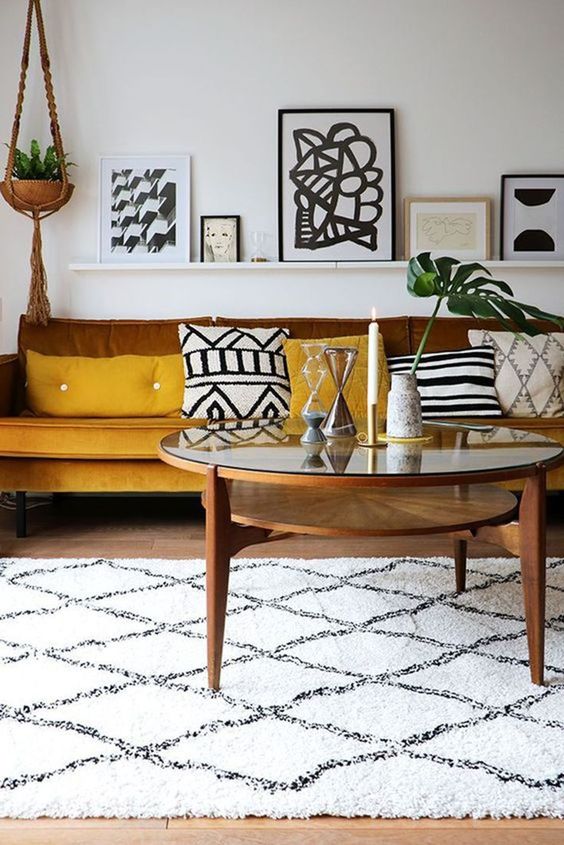
mustard and browns make the boho chic living room more welcoming and brighter

mustard and browns make the boho chic living room more welcoming and brighter

a boho meets mid-century modern living room with bright printed pillows, a rug and colorful furniture
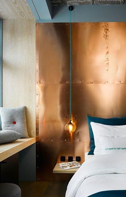
a boho meets mid-century modern living room with bright printed pillows, a rug and colorful furniture

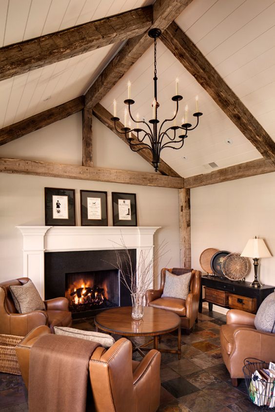
a warm-colored living room with brown leather furniture, a warm-colored rug and wooden beams

a warm-colored living room with brown leather furniture, a warm-colored rug and wooden beams

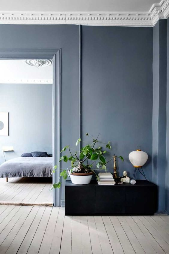
cool hues are amazing for bedrooms and just spaces for relaxation like here greys and blues

cool hues are amazing for bedrooms and just spaces for relaxation like here greys and blues

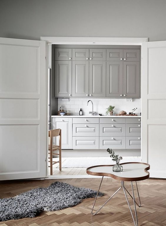
a grey kitchen is a huge trend as grey is the new black and it looks soothing and relaxing

a grey kitchen is a huge trend as grey is the new black and it looks soothing and relaxing

mixing cold and warm hues is a bodl idea, here a copper wall is paired with emerald bedding and grey pillows
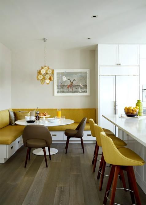
mixing cold and warm hues is a bodl idea, here a copper wall is paired with emerald bedding and grey pillows

infuse your kitchen and dining space with color - go for mustard stools and an upholstered bench plus a chandelier

infuse your kitchen and dining space with color - go for mustard stools and an upholstered bench plus a chandelier

The Complementary Color Scheme

The complementary color scheme is often thought of as the simplest as it involves two shades that are sitting directly opposite each other on the color wheel, meaning you get combinations like blue and orange, yellow and purple or red and green. Such pairs feature extremely high contrast and bring much energy to the space. You should think of them as your accent colors and use plenty of neutrals to balance them out.
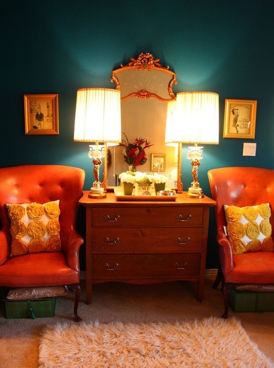
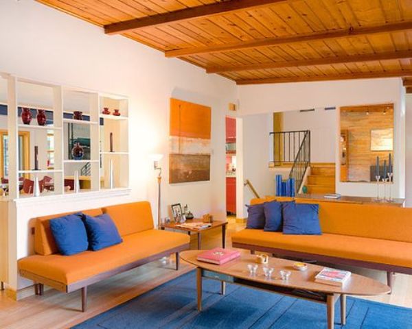
a super bright orange and blue living room calmed down with neutrals is a bold idea

a super bright orange and blue living room calmed down with neutrals is a bold idea

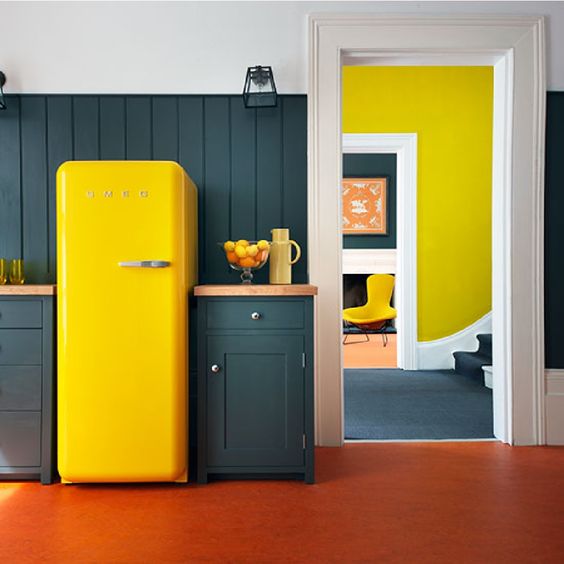
dark green paired with neon yellow is a fantastic combo for decorating a home

dark green paired with neon yellow is a fantastic combo for decorating a home

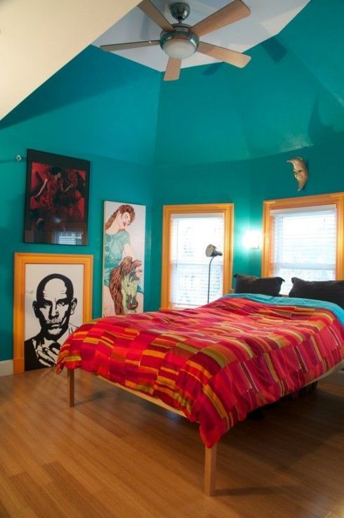
a turquoise bedroom is accented with red bedding and bright yellow framing of the windows

a turquoise bedroom is accented with red bedding and bright yellow framing of the windows

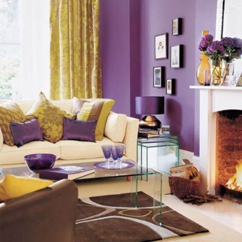
purple and yellow is a very bold and exquisite color scheme to opt for while decorating

purple and yellow is a very bold and exquisite color scheme to opt for while decorating

dark green and orange is a fantastic and bright color combo for those who want a complementary color scheme

dark green and orange is a fantastic and bright color combo for those who want a complementary color scheme

The Analogous Color Scheme

An analogous color scheme is picking a central color, then also use the colors on either side of it. you may use two primary colors and the third will be a mix of these two. You may also use the 60-30-10 rule here to check your proportions and keep them right. You may also use this scheme for mixing up neutrals or even go for a combo of black, white and grey.
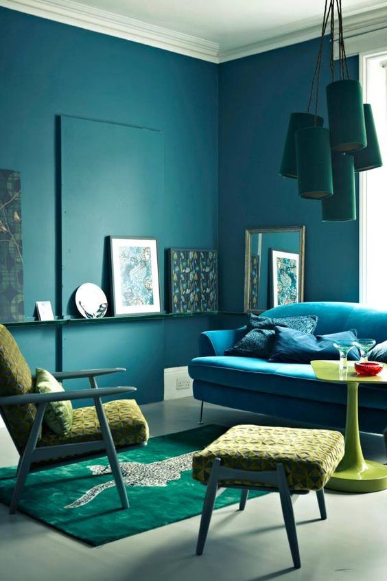
an analogous color scheme in the living room - dark green, turquoise and neon yellow

an analogous color scheme in the living room - dark green, turquoise and neon yellow

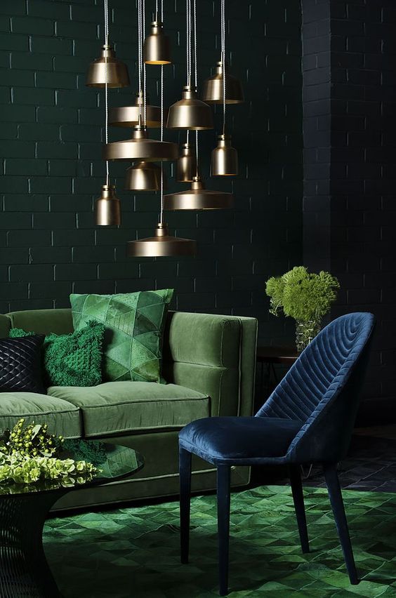
a refined living room with dark green, emerald and navy plus a cluster of brass pendant lamps

a refined living room with dark green, emerald and navy plus a cluster of brass pendant lamps

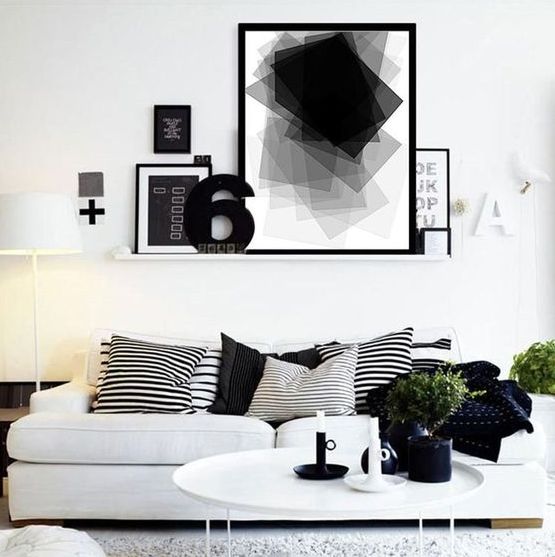
black, grey and white is also an analogous color scheme, which can be refreshed with greenery

black, grey and white is also an analogous color scheme, which can be refreshed with greenery

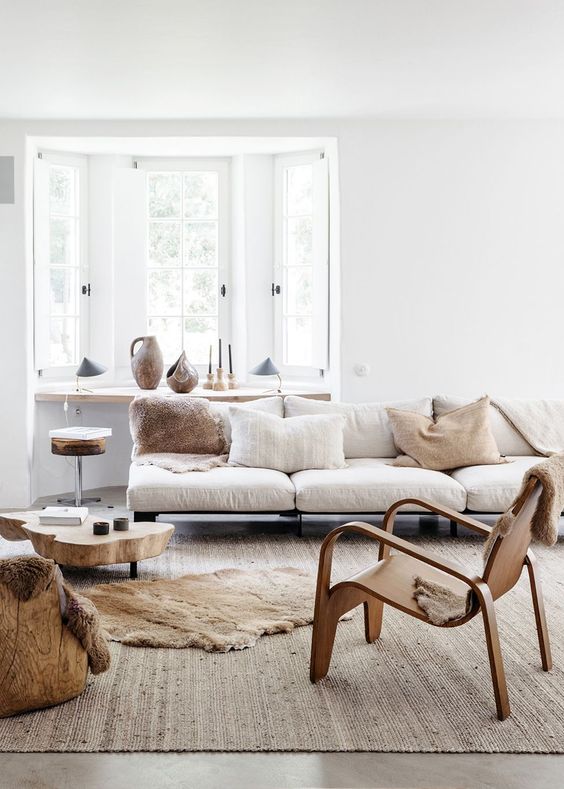
layer up neutrals using an analogous color scheme, it's a fresh and cool idea

layer up neutrals using an analogous color scheme, it's a fresh and cool idea

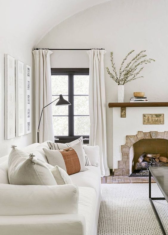
a 1920s Spanish-inspired living room with layered neutrals done in an analogous color scheme

a 1920s Spanish-inspired living room with layered neutrals done in an analogous color scheme

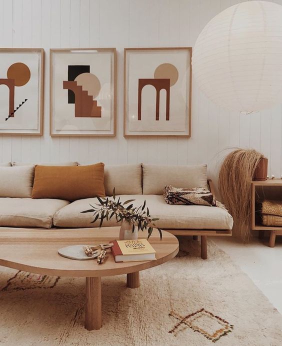
an analogous color scheme with neutrals, mustard and tan for a mid-century modern living room

an analogous color scheme with neutrals, mustard and tan for a mid-century modern living room