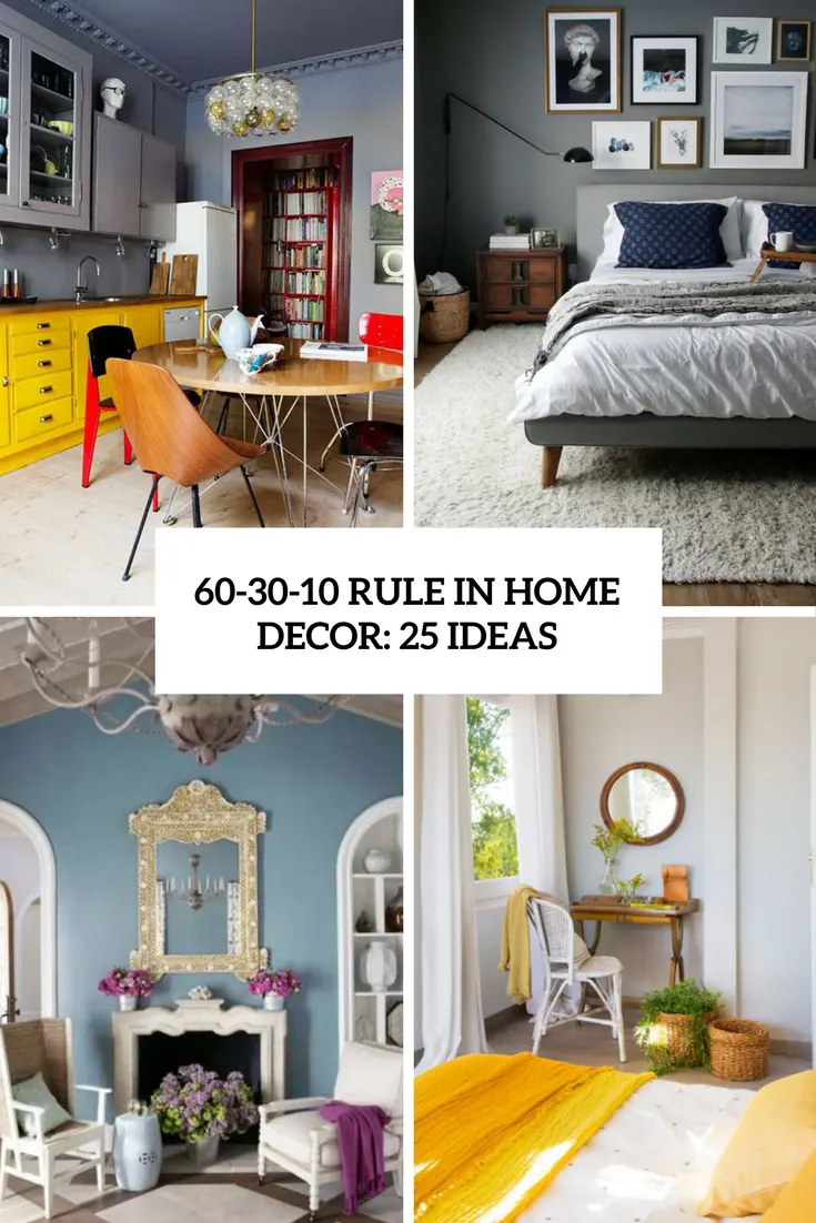
From old times people are trying to find a perfect formula of beautiful decor that would work for any colors and styles and will be timeless. Now here’s the result! There exist a 60-30-10 color formula that will give your interior a harmonious look.
This is a way to combine three colors in the interior decor, and they won’t look excessive, they will be interesting and organic. Let’s have a look at some examples you may try to fit the formula and get a stylish look.
60% Is The Main Color
Choose the main color, which will take at least half of the interior decor. The easiest way is to use the main color on the walls. It is better if it is neutral, so as not to make a mistake. However, if you feel like bright colors – use them but keep all the rest in neutral tones.
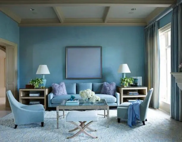
A blue space with grey as an additional color and light-colored ahy wood create a very relaxing ambience.
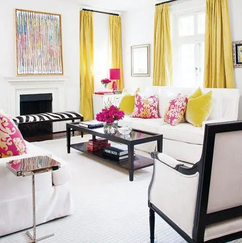
A chic and bold white space is made more colorful with yellow and fuchsia, and black highlights the decor.
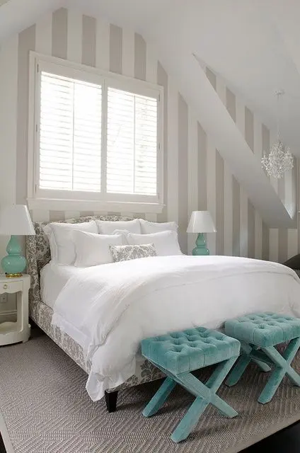
A soft-looking guest bedroom with white as the main color, light grey as additional and a couple of turquoise accents.
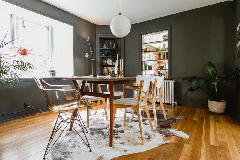
Black is the main color for creating a moody space, natural wood tones are added for calming the space down, and white and metallic make it chic.
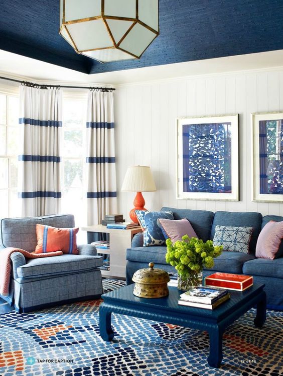
Blue is the main color in this coastal space, and cream pairs perfectly with it, white some coral and red touches highlight the color scheme.
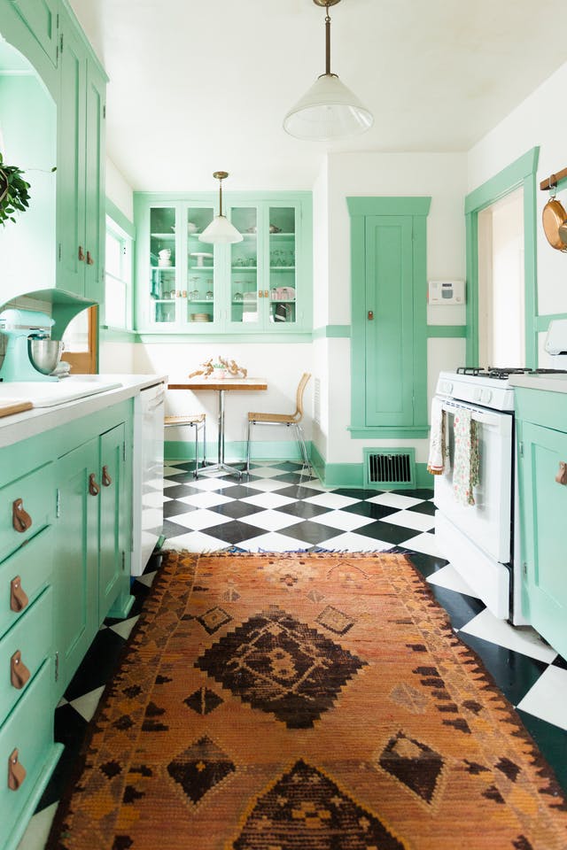
Bright green is the main color here, white is used to calm the space and brown and tan add a soft feel.
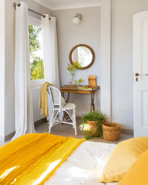
Dove grey as the main color, white as additional and sunny yellow accents create a sunny and bold interior.
30% Is The Additional Color
This color is necessary to enliven the space, add interest, so use your favorite bright shade to make the neutral color palette vivacious or go for some neutrals and pastels to make the bright color calmer. The best idea is to use the additional color on furniture, carpets and curtains. Keep in mind that this color should coordinate with the mina one and the smaller colorful accents that take 10%.
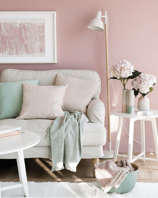
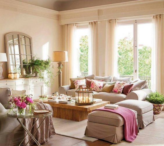
Dusty pink is the main color in this space, and soft neutral shades take 30%, while mint is an accent color.
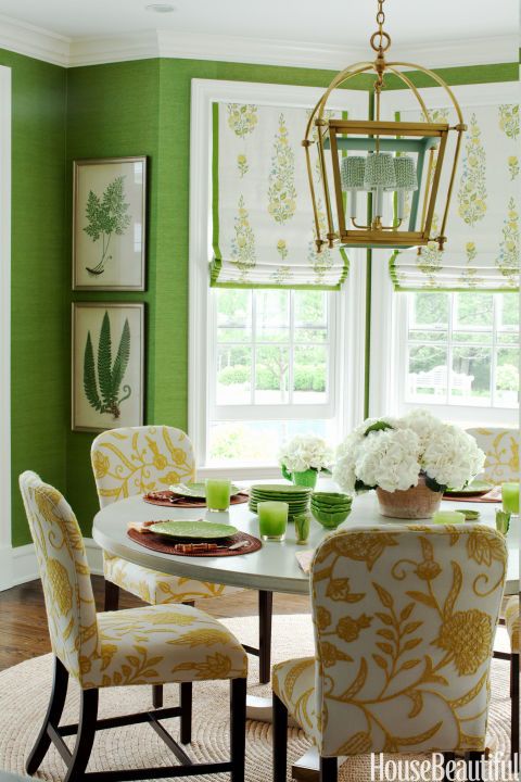
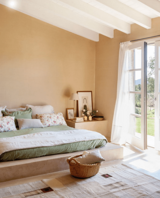
Green is the main color in this organic space, white was added for a fresh look, and yellow and tan soften the space.
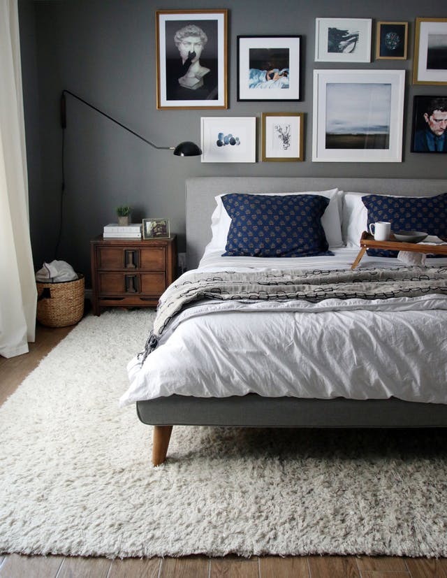
Grey shades are dominant in this room, white are added to refresh the space, and natural wood is for a stylish accent.
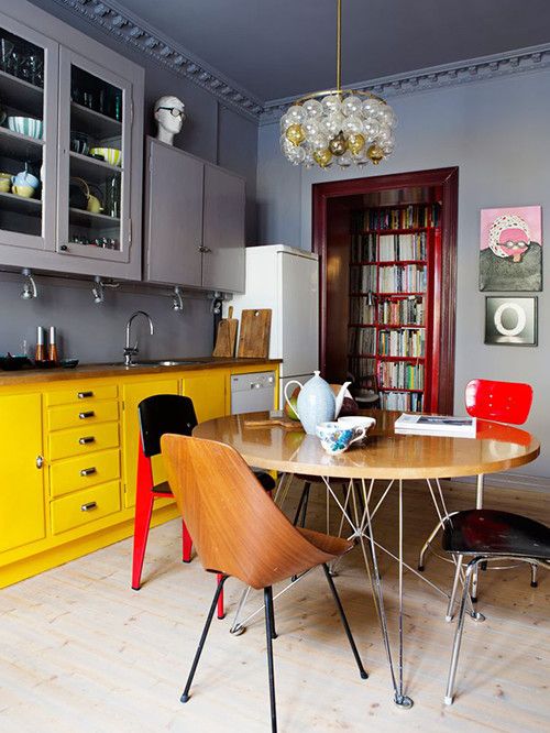
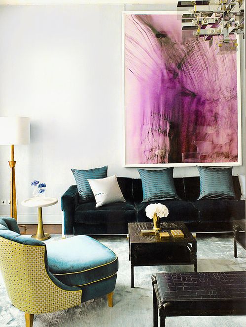
Greyish purple is taken as the main color here, natural wood adds chic and bold yellow and red create a colorful accent.
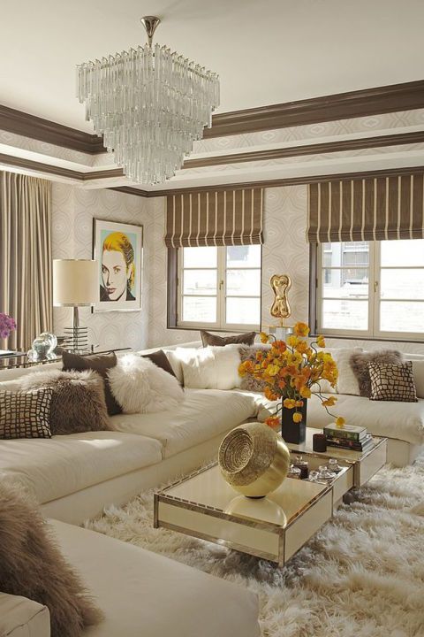
Ivory is the main color in this luxurious space, brown is added for a contrast, and yellow is an accent.
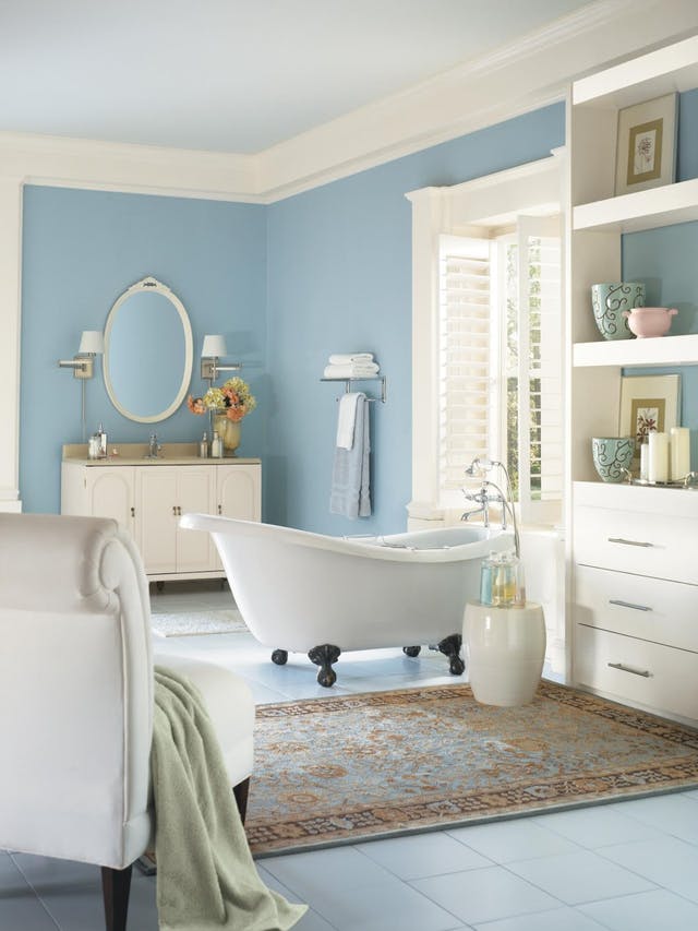
Light blue is the main color in the bathroom, cream and white are additional ones, orange and greens are added for a colorful touch.
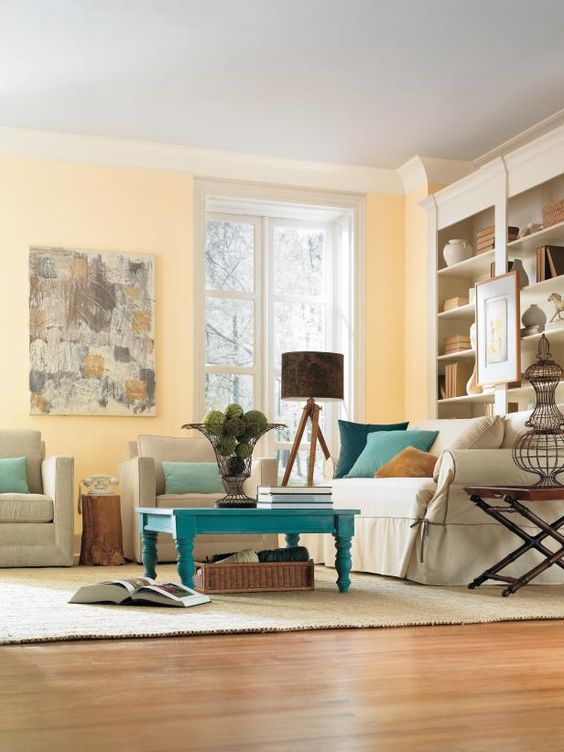
Light grey is the dominant color here, buttermilk is added for a soft touch, and turquoise brings color in.
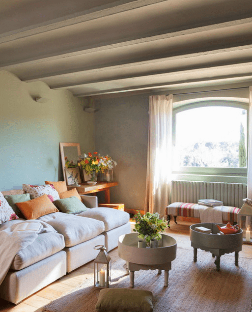
Neutral grey green is the main color, beige is an additional shade and touches of orange enliven the space.
10% Is The Accent
And, finally, the brightest color, which will be icing on the cake, and you can use several shades of the same color to make the decor more interesting. You can use these shades on pillows, vases, paintings and various accessories. If you are tired of the decor, you can easily change these pieces without wasting much money, and you can also add seasonal and holiday touches when you want.
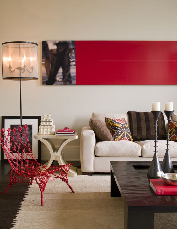
Neutral ivory is the main color here, and chocolate brown creates a contrast, while hot red splashes make the spac emore interesting.
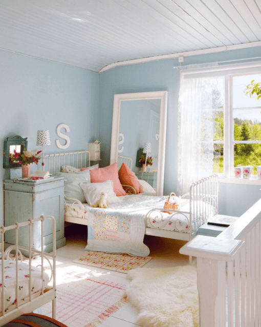
Serenity blue is an ideal main color for a kids' room, soft pinks are additional, and white color polishes it all.
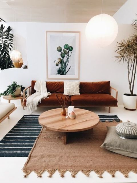
White and cream are taken as main colors, shades of brown and neutral wood add style and softness, and a burnt orange sofa is used for a colorful touch.
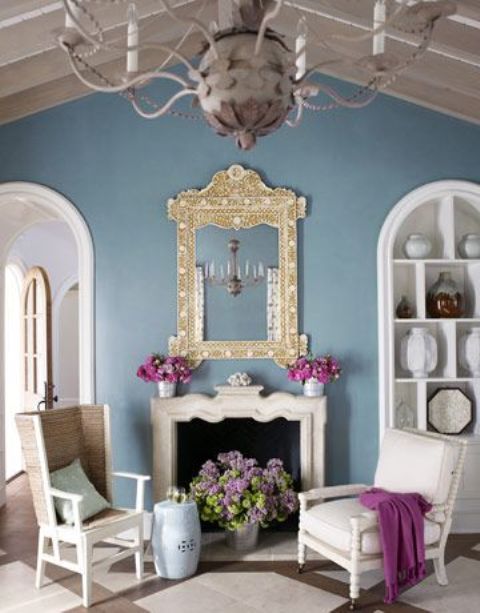
White and grey and the main shades here, and they are completed with a blue wall and fuchsia touches.
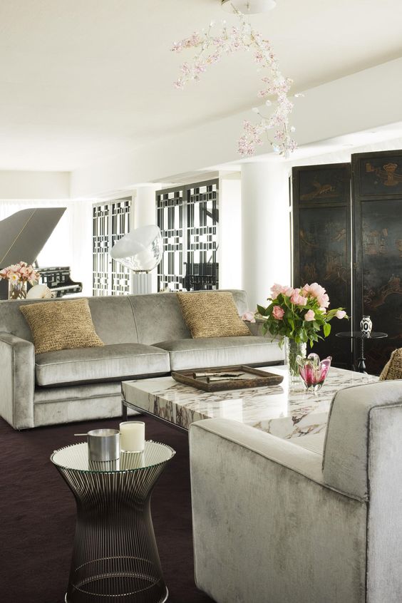
White is a greta dominant color, silver grey adds a refined touch to it and some black details highlight the luxurious space.
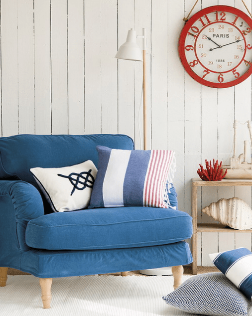
White is the main color for this seaside space, bold blue is additional, and red is icing on the cake.
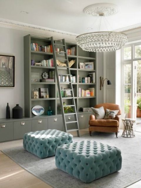
White is the main color here, grey is added in furniture and rugs, and you can see blue ottomans as accents.
